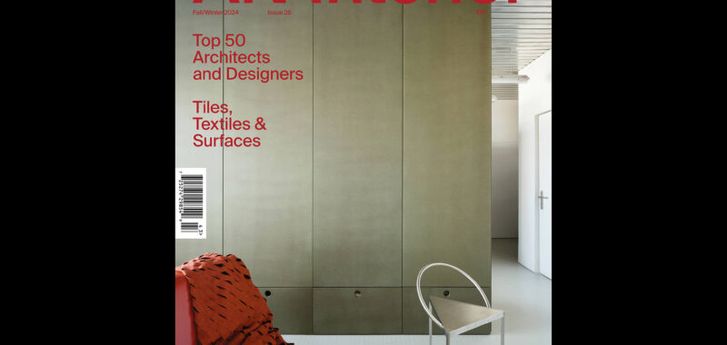
Astute readers might recall the penultimate sentence from my note in the last issue of this magazine: “Each issue of AN Interior is basically a little adventure.” That exploratory vibe is intact here in our latest offering. As you flip through these pages, you might notice that our spreads have had some work done. The publication’s award-winning art direction, which was previously led by Maiarelli Studio, has now been expanded by Studio Loutsis. The results are playful, and there are more colors, typefaces, and collages. The ongoing goal is the savvy sharing of new products, objects, and interiors for our audience of expert eyes. A magazine is a design project just like any other, so along the way there are refinements amid the shifting boundaries of constraints and opportunities.
Perhaps the best example of Studio Loutsis’s innovation is its presentation of our annual Top 50 list. How to display this selection, which consists of established firms and new voices? After some sketches, we landed on the idea to shrinkwrap the list. The result is shiny, metallic, and unexpected, a fitting signature for the creativity of the offices it celebrates.
The following renovation-forward features also lean meta-architectural. Witness spaces architects make for themselves or for architectural production and education, like Sam Jacob Studio’s interiors for the Kent School of Architecture. The scale ranges from a small apartment in Madrid reworked by HANGHAR to a pair of buildings designed by the modernist architect Gene Leedy and reimagined by STRANG. The final one is perhaps the most referential, with Outpost Office delivering an installation that responds to the colliding grids of Peter Eisenman’s Wexner Center with fun, strange details like oversize neon shims.
Archmongers’s raw terrace house redo reminded me of Christopher Wool’s SEESTOPRUN, an exhibition of the artist’s work from the past decade that was on view this summer in New York. Installed on the unoccupied 19th floor of 101 Greenwich, just blocks from Ground Zero, the show pleasantly confused artworks with construction mess. (Interestingly, the space previously housed the offices of Studio Libeskind; and, more recently, the space hosted performances of Buildings I & II, a new play by Richard Maxwell.) SEESTOPRUN spurned the capitalist standards of real estate and art galleries to offer a more materially honest presentation that is less of a perfect image and more of an indexing x-ray. Many architects are taking up a similar mode of inquiry, with encouraging results.
There is still more. Our opening pages are stocked with new furniture, paints, shops, and restaurants, and our Focus section dives deep into the world of tiles, textiles, and surfaces. We even have criticism! Elizabeth Goodspeed wrote and illustrated a piece about the defanged return of postmodern design. Arriving at issue 26 means the magazine is fully grown up, conceptually booted from its parents’ health insurance, and forced to survive on its own in the world. If this edition is any indication, I’d like to think we’re doing just fine.

